When it comes to final editing of your digital underwater images, the white balance should be the first step of your digital post-production workflow. Always.

. Photo by Rico Besserdich.")
Contributed by
Factfile
Rico Besserdich is a widely published German photographer, journalist and artist based in Turkey.
For more information, visit: Maviphoto.com.
See his latest book at: Songofsilence.com.
What is white balance?
Different light sources produce light with slightly different colour tints. Think about sunlight, your camera’s strobe or underwater video lights, for example. By adjusting the white balance, we tell our cameras or imaging software which area of the photo is supposed to be white or neutral grey. This step of editing removes colour casts, and as a result, displays your image with natural colours.
What is important for underwater photography is that a successful adjustment of white balance during post-production requires a sufficient amount of light (colour information) to be existing in the (original) image. This is especially important when shooting in ambient light (using no strobes or any other light sources other than sunlight). As colours do fade away with the increasing depth of a photo dive, one should better not expect to be able to restore colours of underwater images taken in deeper waters (10m and more) using sunlight as the only light source.
When using underwater strobes, it is a different story. Underwater shots that are entirely lit by a strobe or flashgun (i.e. most macro shots) often require only minimal white balance adjustments—sometimes, none at all. However, the moment two or more different light sources are present in one image is the moment a colour cast will show up. In underwater photography, we have to deal with a cyan colour cast most of the time. This can be fixed by adjusting the white balance during post-production.
What we need:
- Photographs in RAW or DNG format. Those are the only formats that give you the opportunity to adjust the white balance after you take the shot. If you shoot in JPG, you hadbetter go for a manual white balance in your camera.
- A colour-calibrated computer screen. Proper monitor calibration will ensure that your colours and black levels are true, which is crucial for proper image editing and for later printing.
- An image editing software that is able to process RAW (or DNG) images. Adobe Photoshop or Lightroom are the classics here, but any RAW processor can do the job, even the (free) one on your camera’s software CD-ROM.
This tutorial utilises Adobe Lightroom (LR) and Photoshop (PS). In terms of editing RAW images, Photoshop’s ACR (Adobe Camera Raw) and Lightroom are based on the same software engine. The only difference is the user interface.
Note: It is not necessary to own the newest versions of PS and/or LR; older versions work fine, too.
Adjusting white balance
In this tutorial, we are using the example of an image of a yawning lionfish from the Ras Mohammed National Park, Red Sea, Egypt. Depth: around 8m. Light source: one 2500-Lumen video light, plus some ambient light from the sun.
In Photoshop, open the RAW file in ACR by double-clicking in Adobe Bridge or by dragging and dropping your RAW file on the Photoshop icon. Photoshop starts and ACR pops up. (See Image 1)
In Lightroom, import the image into your Lightroom catalog by using the import option. (See Image 2)
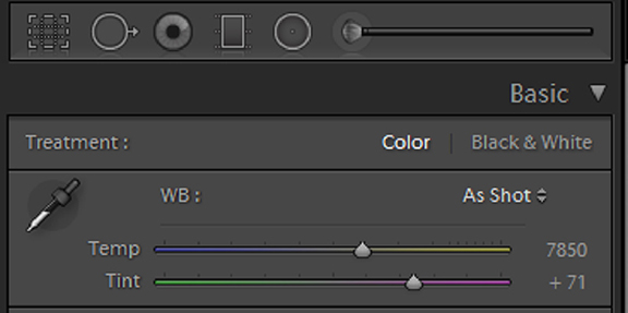
Lots of fancy sliders here, but we only need the white balance section, found at the top-right corner of both programmes. (See Images 3 and 4)
In this example, the camera was set to “AWB” (automatic white balance), and I think we can agree that something needs to be fixed here, as this image suffers a serious cyan colour cast.
ACR and Lightroom offer a couple of white balance presets (such as “auto,” “daylight,” “cloudy,” etc.), but those rarely work well with underwater images. So, let’s leave the image as it is: “as shot.”
The tool offers us a colour picker, a slider for the temperature, and a slider for the tint. “Temperature” defines the colour temperature in Kelvin. This slider goes from blue (cold light) to yellow (very warm light). “Tint” defines the colour range between green and magenta. Slide the sliders and see what happens. No worries, going back to “as shot” always brings you back to the original state of the image. What is important here is developing a sense for the colours by watching the change of the finest details very carefully.
And then there is the colour picker. Let’s start with that one. Using the colour picker, you basically click on an area in your photo that is supposed to be white or grey. It comes in handy here to be able to remember what should be white (or grey) and what should not.
I recommend using the colour picker for a first “rough mix” and then doing the fine adjustments by using the temperature and tint sliders.
Getting back to our yawning lionfish—as I recall, the “lips” of that fish are supposed to be (more or less) white. I use the colour picker and just click somewhere on the area of the fish’s lips. (See Image 5)
The red circle indicates the area where to do a pick. In some cases, several attempts are needed to achieve a pleasing result. See Image 6 for how the picture looks after using the white balance colour picker.
The cyan colour cast is gone, and the colours (and thus the overall image) look better already. But looking carefully at the image, we notice that there is now a bit too much magenta in it.
In this example, we just need to move back the tint slider a bit. Remember, this slider adjusts colours from green to magenta. After using the colour picker, the tint slider went to “+150”—obviously, too much magenta. Moving it back to around “+1242 fixes the problem here. Now, you can move the temperature slider a bit, making your image look warmer or colder. That is totally up to you and how you want your image to look like. I leave it here at the “picked” value of “11750.” Now, the image looks like Image 7.
Tip 1: When PS or LR displays extreme high “temperature” and “tint” values (temperature at or near 15,000; tint at or near 150) after applying the above-mentioned technique, this often indicates an insufficient amount of light and colour information in the original image file. Colour information that does not exist (in the original image) cannot be restored.
Tip 2: When placing the white balance picker tool on parts of your image, PS and LR always display the RGB values (right below the histogram) of that specific area. If the value shows “255, 255, 255,” this means that a pure white already exists in the image and not much can be done regarding white balance. ■


")