Selective color is a multi-step procedure in postproduction of images, allowing certain colors to be highlighted while removing color in the rest of the image. Underwater photographer John A. Ares gives us a step-by-step look at how one can use this unique effect to transform underwater images into artistic creations.
")
Contributed by
To do selective color, you must master two techniques: 1) black-and-white (B&W) conversion of color images (there are several methods to do this); and 2) layer masking in Photoshop.
For layer masking in Photoshop, four tools and actions are employed:
• Brush tool
• Setting default foreground and background colors
• Switching between foreground and background colors
• Layer Mask tool
If you are not familiar with these tools and actions, search the internet or YouTube for tutorials.
In processing images, selective color is one arrow in our quiver of tools for creativity in tonality, B&W, and monochrome, such as sepia and cyanotype.
Simple selective color
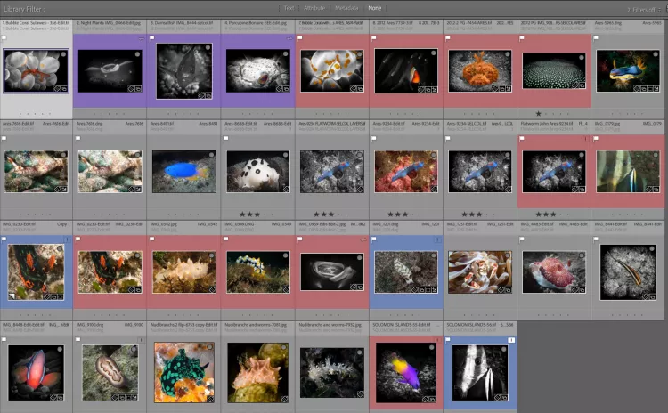
1. The first step in constructing a selective color photo is finding candidate images. Personally, I use the Collections feature of Lightroom to add virtual copies of photos that have dramatic color or colors. Sometimes, the areas of color can be small or large. This is a completely subjective decision. The idea behind using Collections is to have a range of choices for your first attempt. (See Screenshot 1.)
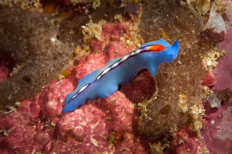
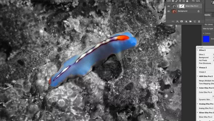
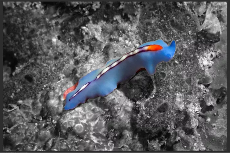
2. Make a copy of the image you want to modify. In this case, I use an image of a flatworm from Dumaguete in the Philippines. (See Photo 2.)
3. The next step is to do a B&W conversion that creates a top layer over the original color layer, which is the base layer. Any photo-editing software that supports layers can be used. I have seen a plug-in from one that adds layers and layer masking to Lightroom, but I have not tried it yet.
Indeed, B&W conversion is a significant topic for discussion on its own, given all the methods available.
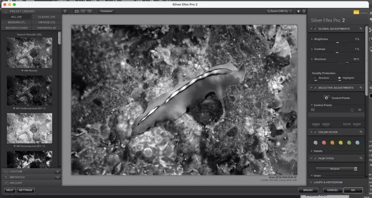

TIP: In Photoshop, you can simply duplicate the layer. The layer on top should be the one converted to B&W. I use Nik Silver Efex because it has a slider called “Structure” that increases mid-tone contrast. There have been several versions of the Nik Collection, which are now available for purchase from DXO at: nikcollection.dxo.com. (See Screenshot 2.)
4. Select the default foreground and background color by clicking the icon in the red circle shown. (See Screenshot 3.) Black is the foreground color.
5. The next step is to apply a layer mask to the top layer. Be sure the top layer is selected.
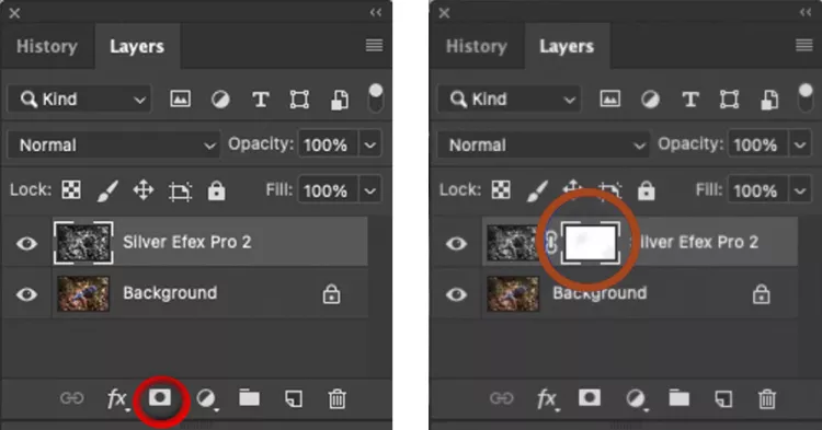
6. Go to the Layers panel and click on the icon (circled in red) at the bottom of the panel. (See Screenshot 4.) You will see a white rectangle appear to the right of the top layer. (See Screenshot 5.)
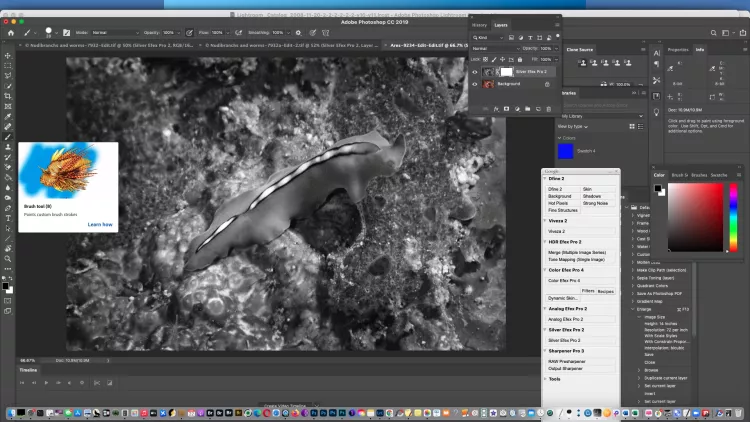
7. Then, activate the Brush tool to paint ON THE PHOTO where you want the color to appear. This will allow the color to bleed through the top layer, exposing the base layer color underneath. The Brush tool is in the toolbar on the left side of the Photoshop workspace. (See Screenshot 6.)
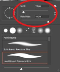
8. Go to the Brush tool, right-click on it, select a brush width and hardness (preferably 100% hardness to start), and select a brush size of perhaps 20 to 100, depending on the area you need to mask. Do not be afraid to experiment if you made a copy of your file. You can use a wide area at first and then use a smaller area when you get close to the edges of where you want the color to stop. (See Screenshot 7.)
9. Paint over the area you want to highlight. Do not worry if you go over the border of your “color boundary.” You have been uncovering the color at this point, using “black” as the foreground color to reveal color in the base layer. (See Screenshot 8.)

10. If you need to fix the border because you exposed too much color into the B&W area, hit the X key to switch to the background color (white) and paint over the “mistake” to restore the B&W to the masking area of the top layer. (See Screenshot 9.)
11. Hit the X key again to continue masking until you are done. (See Screenshot 10.)
12. Save your work in a TIFF format to preserve the layers if you want to make future adjustments. Layers are not supported in JPG files.
Complex selective color
Aside from dramatic color, you can take a more subtle approach. You can look for areas that may have a hint of glow. You can also look for photos that are predominantly B&W, but the subject has a good amount of tint.
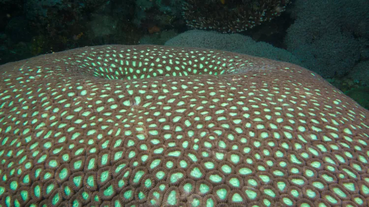
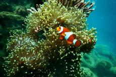
Coralscape. This photo (on the first page of this article) took days to render as selective color. By processing this image with selective color, the coral is turned into B&W, removing color that is not needed and adding an artistic look to the green polyps, so that they appear to “glow” next to the B&W background. However, producing this image tried my patience, owing to the sheer number of polyps. But the technique is the same as for simple selective color images, and I was happy with the result. It helps to do the editing a little at a time and take frequent breaks. (See Photo 3 “Before” above, and Photo 1 “After” at the top of this story.)
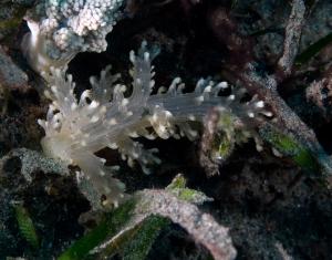
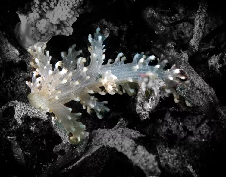
Nudibranch. My image of an unusual nudibranch was taken in the sea grass off North Sulawesi, Indonesia. The background color did not contribute to the overall composition. The tonal range of the nudibranch was almost B&W but not quite. The image benefitted from a darkening of the background and a masking of the nudibranch, allowing it to stand out in its subtlety. Again, the techniques used were the same as the ones described at the beginning of this article. (See Photo 4 “Before,” and Photo 5 “After.”)
Afterthoughts
If you have an image that you think could be optimized with the use of creative effects, try your hand at selective color and give it a spin. You may find the results surprisingly sublime!
A former senior management consultant for Fortune 100 companies, studio commercial photographer and trained biologist and marine food toxicologist, John A. Ares is an assignment and stock photographer and image consultant based on Staten Island in New York City, specializing in portraits, nature, travel, underwater, food/restaurant and fine art photography. An avid diver, he has been a PADI instructor and instructor trainer, teaching underwater photography courses and traveling to many exotic dive destinations around the world. A member of the New York Underwater Photographic Society (NYUPS) and American Society of Media Photographers (ASMP), he has served as an associate editor and photographer for Seafood America magazine and his work has won competitions of American Photographer magazine. He also conducts training seminars and has been a presenter at Beneath The Sea and NYUPS. For more information, visit: JohnAres.com


")