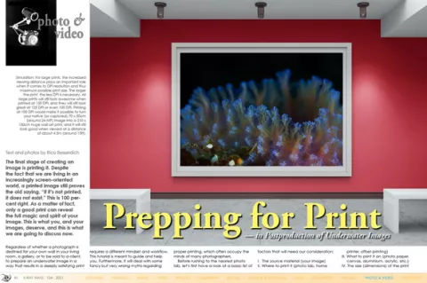
The final stage of creating an image is printing it. Despite the fact that we are living in an increasingly screen-oriented world, a printed image still proves the old saying, “If it’s not printed, it does not exist.” This is 100 percent right. As a matter of fact, only a good print can reveal the full magic and spirit of your image. This is what you, and your images, deserve, and this is what we are going to discuss now.


 helps in matching the print with the image on the monitor. Photos by Rico Besserdich.")

 often results in confusion and even disappointment, as any standard monitor cannot display the final CMYK result correctly, thus leaving you uncertain of how your print will look—especially when it comes to blue colour tones! Therefore, leave the correct colour conversion to the print lab. A print lab that insists on receiving CMYK images (for a large print) from you, is a print lab you better avoid. If you do not have any other choice, (in Photoshop) go to Edit > Convert to Profile and pick the CMYK colour space in the “Destination Space” field. Usually, US Web Coated CMYK serves as a widely accepted standard. Photo by Rico Besserdich.")
 lets you temporarily simulate how an image will appear on another device, such as a printer. However, soft proofing only works accurately when using DDC (14-Bit) monitors that can be fully calibrated to printing and industry standards. Soft proofing on standard monitors does not help much as the display of the “soft proof” cannot be 100% trusted. Standard monitors can give you only a rough value of how your image may look when printed. Photo by Rico Besserdich.")

Contributed by
Regardless of whether a photograph is destined for your own wall in your living room, a gallery, or to be sold to a client, to prepare an underwater image in a way that results in a deeply satisfying print requires a different mindset and workflow. This tutorial is meant to guide and help you. Furthermore, it will deal with some fancy but very wrong myths regarding proper printing, which often occupy the minds of many photographers.
Before rushing to the nearest photo lab, let’s first have a look at a basic list of factors that will need our consideration:
I. The source material (your image)
II. Where to print it (photo lab, home printer, offset printing)
III. What to print it on (photo paper, canvas, aluminium, acrylic, etc.)
IV. The size (dimensions) of the print
I. Your image
Your starting point should be to have a final processed (edited) image in its native dimensions (as shot, or as cropped to your taste), in Adobe RGB 1998 colour space, and in high resolution, which is 300 DPI in today’s standards. Ideally, you have saved (or exported) it as an 8-Bit TIFF.
Hint: Always create a copy of your original image file when preparing it for print. A print-optimized or edited image might not serve well for an online magazine or social media; and vice versa, it is the same story—a screen-optimized image will not serve well for print. It is always a good idea to have the original file saved somewhere, and then create and edit a copy of it, depending on the specific task.
Now comes the moment of truth. You did calibrate your monitor before editing your image, right? If not, now is the very last chance to do so. There is no point in spending hours and hours processing your photos for print if you have not calibrated your monitor.
What is monitor calibration for?
Logically, you want to be able to match your monitor display with that of your print as closely as possible. To do that, it would be wise to calibrate your monitor. A calibration adjusts the balance of colour and contrasts displayed on your monitor so that it more accurately reflects how your images look (in realistic colours) and how your print will look.
To perform a calibration, you need two things: a spectrometer and calibration software. A spectrometer is a piece of hardware that detects the balance of colours and contrasts on your monitor and allows the calibration software to make adjustments in order to display colours more accurately. The result will be a colour profile that will be loaded automatically to your graphic card whenever you start your computer. (This applies to standard monitors only. A high-end monitor has an in-built calibration device and will store the calibration results by itself).
About monitors
Please bear in mind that almost all monitors (standalone or build-in ones, such as laptop screens) come with factory settings that actually display everything “better than in life.” Strong contrasts, popping colours—everything looks just great. However, by trusting an uncalibrated monitor’s colour display and then attempting to print one’s image can quickly result in disappointment, as the print will not look like your edited image on your uncalibrated monitor. Even slightly better monitors (such as my own Samsung SyncMaster) promise amazing things such as “50.000:1 Dynamic Contrast” and “16.7 million colours,” etc. And what does it all mean for prints? Nothing. Be smart and calibrate your monitor. But beware of the following commonly held myths.
Myth Nr. 1: “A perfectly calibrated monitor will show me exactly how my image will look when printed.”
Unless you have a print-dedicated monitor (and we are talking about monitors in a price range of US$ 5,000–12,000), you can only hope to get “as close as you can,” even with a calibrated monitor. This means, thanks to your calibration, that the reds in your image will not look purple or orange in print, and the black and white points will be set correctly. Therefore, calibrating your monitor is important, but when it comes to print, we need to think a bit further.
Why is this so?
First of all, monitors (and the images displayed on them) are back-lit, but prints are front-lit. This feature effects the brightness of your printed image dramatically, because almost all monitors are simply set far too bright, thus resulting in a print that is a bit too dark.
Tip: Professional printing technicians always recommend raising the brightness of the image you want to print by 10 to 20 percent. However, make sure you do not get burned out whites when doing so. Whenever you feel unsure, just refer to the histogram. Monitors may display whatever they want, but the histogram always show the “truth.”
Secondly, except for some really expensive ones, all monitors—regardless of whether they promise “16.7 million colours” or whatever—operate in the so-called “Standard Red, Green, Blue” (sRGB) colour range. By the way, this matches the mighty promises of my monitor (and probably yours, too) of 256 values of red, 256 of blue and 256 of green, or 256 x 256 x 256 = 16,777,216. Voila! We all snorkel in the tiny colour range of sRGB.
Professional print labs, however, can print colours far beyond this number. In essence, sRGB was invented to be a sort of standard (i.e., everything looks the same everywhere). It works fine for computer screens (including display of websites, social media, etc.), but print is different. Well, at least, good prints are.
Then (and we are still talking about how your image looks on your monitor and how it looks when printed), we also need to think about different types of monitors.
Types of monitors
A regular monitor (and 99 percent of you will have a regular monitor) operates in the sRGB colour space and (working together with your computer’s graphic card) 8-Bit colour depth. An 8-Bit monitor is okay, but it cannot show you subtle details in shadows, highlights and gradations of colour. A DDC (display data channel) monitor can show colours up to 14 Bits (which means more details). Such a monitor will show 98 to 108 percent of Adobe 1998 RGB colour space (which is pretty awesome). However, buying a DDC monitor will be tough on your piggy bank. Yet, it is, of course, cheaper than booking a trip to the Sardine Run.
Conclusion: Even a calibrated monitor can only display something “near to it” (the actual print colour) when it comes to prepping images for print. If you want to be 100 percent sure, you will need to request a hard proof from your printer or photo lab. Please keep on reading.
Myth nr. 2: “16-Bit is best!”
Some image-editing software will allow you to save TIFF files in 16-Bit, for example. Lured by sirens to sail towards the 16-Bit rock (metaphorically-speaking), we may think “the bigger the better!” However, just like the song of the sirens in Greek mythology, the 16-Bit song does not make any sense, at least not when it comes to print.
Why is this so?
First of all, we just learned that even the best monitors can display only 14-Bit. This means that our display devices cannot display what is in an image.
The bit range has an effect on the dynamic range of any image—theoretically. So, if saving an image as a 16-Bit TIFF, the only thing you would do is create a huge file, without any benefits—in print or elsewhere. On a personal note, think about your carbon footprint: Transferring data through the internet requires energy. Creating energy harms our planet. Please help save our planet by reducing the file sizes of your data. Please check out the Green Web Foundation if you want to learn more. Go to: thegreenwebfoundation.org
Secondly, even if you send a 16-Bit TIFF image to a photo lab for printing, the processing software of that lab (and by the way, many labs do not know this) will automatically reduce your mighty 16-Bit image file into a standard 8-Bit image file. Therefore, saving your image for print as an 8-Bit TIFF file will be the right thing to do.
Myth nr. 3: “Use ProPhoto RGB, and you will be just fine.”
Well, keep on dreaming. ProPhoto RGB is a standard specifically available to users of Adobe Lightroom, but it is offered by some other image-editing programs as well. This colour profile promises to store more colours and colour information in your (final edited) image than the classic “Adobe RGB 1998” does. This, so far, is true. However, 99.9% of all photo labs simply cannot process (and print) images with the ProPhoto RGB colour range—at least not with the colours that ProPhoto RGB promises. When working in Adobe Lightroom, it might be good to work on 16-Bit files in the ProPhoto colour space, just to bring out very subtle details of your image during postproduction. Of course, ProPhoto RGB exists for several reasons, however, printing is not exactly one of those reasons.
II. Where to print it
If you want to print your image on your own home printer, that is okay—please go ahead. However, you should at least buy yourself some proper photo paper, as images printed on standard A4 paper will simply look terrible.
Most photographers, when they get to the point where they want their images printed in a really nice way, will end up at a photo lab. Now in printing, the universal rule, “you get what you pay for,” applies. So, if you are tempted by an online printing service that offers you a 60 x 40cm print for as little as US$2.99, you certainly will get what you paid for—which means, not much. When you are thinking about printing your images, think about how much money and time you spent on photo equipment, trips to special locations, and all that stuff. Now, when it finally comes down to it, the final step—the printing of your images—well, this is the wrong time to be stingy.
Considering that you may not have a high-end photo printer, or even a plotter, at home, you most likely will submit your images to a photo lab. They print photos every day, so they should know best how to do it, right? At any rate, it is just so easy to upload a file, pay with your credit card, and wait for the postman to ring twice.
Of course, everything depends on your personal preferences. If you are happy with your printed image, then you are happy—and there is nothing more to discuss.
However, low-cost print labs are usually happy with you just submitting an sRGB image, since their printing machines cannot produce anything better anyway. If you submit an RGB image, they will convert it into sRGB. However, if a lab requests your image to be submitted in sRGB colour mode, you better do the conversion yourself. Keep control of everything.
Many people will not even see the difference, but you certainly will. There is nothing wrong with sRGB colour space. It is just that if you worked so hard to get the perfect shot, you certainly do not want to see any details missing in the final print.
As I said in the beginning, the print is the very final stage of your image creation, which means it is no time to skimp and pay peanuts, no time for compromises. What is the point in investing US$15,000 or more on fine camera equipment, and perhaps another US$5,000 on a trip to somewhere nice, and then have your image printed at the lowest possible quality?
Side note: Many online photo printing services do not even have their own printing labs. They might look very “professional,” offering you “awesome” deals and promising you the Holy Land of image printing, but in the end, they are just re-sellers of big labs. This means that your submitted image might be automatically altered (there is no human to blame behind this—everything is done via scripts and algorithms), forwarded to the photo lab for printing, and then posted to you.
I have heard of cases in which photographers did not even recognize their very own images after the final prints were delivered to their homes. Yes, it was that bad. So, when submitting images to a printing lab, make sure they print it themselves. Serious labs always clearly state where your images will be printed. Any third parties or re-sellers could be a very difficult bunch to deal with, in case you are unhappy with your print and want it re-done (or you want your money back).
A professional photo lab will usually ask you to submit your image to print as an 8-Bit TIFF in Adobe 1998 RGB colour mode. If your image is of proper quality (in terms of printing, this means nicely exposed, properly edited, and of sufficient resolution), the photo lab will take it from there, meaning, they will take care of anything else that should be done to print your image in the best quality possible. This might be not very cheap, but it is worth every cent.
Myth Nr. 4: “I must always convert my images to CMYK.”
It is, of course, true that most professional printers work and print in CMYK colour mode. CMYK refers to the primary colours: Cyan, Magenta, Yellow, and Key (i.e., Black). These are the inks used on the press in “4-color process printing,” also known as “four-colour printing.”
That said, your RGB image (as captured by your camera and processed in your computer) should be converted to CMYK. But how can you be sure the colours (after the conversion) are correct or will display as intended in the print if your (even calibrated) monitor can only display sRGB colour mode? The simple answer: You can’t.
You can only simulate it (by converting the colour profile in your image-editing software) and get a rough clue about how your image may perhaps look in a CMYK print. You can even go one step farther by assigning specific ICC printer profiles to your image (again, in your editing software). But still, your monitor is based on sRGB colour mode, thus it is not able to display how the printed image will finally look—at least, not if you print something better than sRGB.
As I said before, we are talking about serious, professional printers. So, to shed some light on the “CMYK Myth,” let’s quote Mr Xander Fischer, a printing technician at Print Lab Chicago—a high-end print lab for fine art prints. In short, these guys have made printing their life. Xander says, “Please, please, please do not send us CMYK images!”
The thing (behind that) is, we simply cannot do what they can do. Proper colour conversions (such as from RGB to CMYK) are not something to be done with just a mouse-click in Photoshop or elsewhere. A successful conversion depends on many more factors, such as the image itself, the material it will be printed on, and the capability of the printing machine.
That said, leave the colour conversion to the print lab. They have print-dedicated monitors that can simulate up to 99 percent how the image will look in print, they know how the colours will look on the paper (or other material) you order, and they know how to squeeze out even the finest colour details. They can do things we cannot do with our computers and monitors (even if they are good ones).
Any photo lab that forces you to deliver CMYK converted images is simply too lazy to do a proper printing job. This applies mostly to many of the online photo labs, because their entire printing process—from you submitting the image and ordering a print, to them doing that print and delivering it to you—is entirely automated. There is absolutely no one that personally takes a look at your image, perhaps performing slight adjustments to make your print look like it deserves to look. As I said before: You get what you pay for. Go cheap, and your print will look cheap.
Conclusion: Choose a proper printing lab. Pay them their proper fee and see your image printed in a quality that not even you could believe existed. Don’t make yourself crazy with RGB-CMYK colour conversions.
Myth Nr. 5: “I am good because I did a soft proof.”
Soft proofing is the ability to view a simulation (on your computer monitor) of how your image will look when it is printed. Soft proofing, despite professional image-editing programs such as Photoshop or Lightroom offering it, still remains a simulation, which often lacks any reflection of reality. As a matter of fact, soft proofing only works on a monitor that you can calibrate 100% (like a DDC monitor). In all other cases (which means, all other monitors), soft proofing is pretty much pointless.
If you are picky and want to be sure, you have no other choice but to request (and perhaps pay extra for) a hard proof from your photo lab of choice. A hard proof is a digital printing sample for checking the colour quality of printing files before commencing the final print run. In simple words, a hard proof is a printed piece of paper that will show you how the colours and contrasts will look in the final print.
When a single large format poster print is the goal, the hard proof might only show a fraction of it. Yet, all colours will be exactly as it will be in the final print. A hard proof is something physical (printed on paper), which you will have to examine in person, and perhaps require specific changes in terms of colour and contrast range. This might cost more money (every time a printer prints something, it costs money), but this is how the pros do it.
III. The material to print on
The material you finally want to use, to bring your printed image to life, pretty much affects the expression of your image. As a general rule: Each print medium has its own perceived brightness and ambient reflectivity. Therefore, it makes a serious difference whether you print on paper, or, let’s say, aluminium or canvas. Aluminium prints and lumachrome acrylic prints have high ambient reflectivity and perceived brightness, therefore they require very little, if any, brightness adjustment. Traditional inkjet prints and canvas require a lot more brightness adjustments if you want the printed images to look the same as they look on your computer monitor.
Myth Nr. 6: “For a proper printing result, I must always over-sharpen my images in postproduction.”
It is true, that, when printing on paper (any type of paper), images might lose a tiny bit of sharpness due to the printing process on that paper. Therefore, it is said that you should add a bit of extra sharpness to your images, in order to compensate for this effect.
However, even if this applies to pretty cheap types of paper, it does not apply to all types of paper, nor to other materials such as aluminium or acrylic. In fact, an over-sharpened image looks terrible when printed on aluminium. Of course, your image should be sharp and in focus anyway. If it is not, even the best print lab cannot help it. What the human eye perceives as being sharp is, actually, more a matter of contrasts. A photo with proper contrasts will be perceived as sharp, meaning that what is more important than sharpening in postproduction is to take care of a proper contrast range.
But if you plan to print on paper, and if you want to really be on the “safe side,” you might want to consider adding +5 to a maximum of +10% in sharpness when editing your images for print. No more! When doing so, please make sure you only sharpen areas (of your images) that need to be sharpened. There is no need to sharpen areas of blue water!
IV. The size of your print
Myth nr. 7: “It always must be 300 DPI, no matter what!”
Needing 300 dpi for whatever size you are printing is a myth. In essence, 300 DPI is a general standard—a common denominator, just like sRGB. A resolution of 300 DPI only makes sense when publishing images in print magazines, catalogues, brochures or books.
The key is the viewing distance. A magazine or book is usually viewed at a distance of 40 to 50cm. Such close viewing distance indeed requires a higher resolution, a resolution that guaranties “photo realism,” meaning, all details in the image are exactly as captured by the camera.
However, to print an image on a full A4 (21 x 29.7cm) page (like in a magazine or book) in 300 DPI “photo realistic” quality, an image resolution of 2480 x 3508 pixels is required. This would be equal to an 8.7 MP (megapixel) image. If you deliver an 18, 24 or even 50 MP image, it will not make any difference. But for a nice big print to be hung on a wall, we theoretically might need a bit more.
So, let’s imagine you have a 24 MP camera. This resolution would allow for a high-quality print (300 DPI, photo-realistic) of 76.2 x 50.8cm (30 x 20 inches). That is already a nice print size, but what would it mean if your camera produced image files, not at 24 MP, but only at 12 MP? Would you be limited to just a 15 x 10in print (38.1 x 25.4cm, half the size of the 24 MP version) because your camera lacks resolution, thus finally forcing you to raid your piggy bank and go for a “better” camera?
The answer is no.
As a simple matter of fact, large format prints are actually never printed at 300 DPI. Most print labs these days can produce beautiful images at 150 DPI, or sometimes even lower. There is no noticeable difference between 150 and 300 DPI for most images. The larger you print your image, the larger the viewing distance will be. The average person cannot detect any difference between 150 and 300 DPI, at a normal viewing distance. Period.
What this means for you is that instead of upsizing your image in Photoshop (which is not recommended anyway since artificial upscaling of images results in blurriness and pixelation) you can change its size just by just altering the DPI amount.
Changing the DPI value of a 24 MP image from 300 to 150 DPI will result in doubling the size of printable image dimensions. This means that instead of a 30 x 20in (76.2 x 50.8cm) print, you could print a 60 x 40in (152.4 x 101.6cm) print. That’s a seriously big print!
You could even go as low as 125 DPI, which would allow a print of 178 x 118cm—a big print, and yet it would look beautiful, because absolutely none (except you, perhaps) will ever look at such a large print from a 40cm distance.
Here, a simple general rule might be of use: The diagonal of your printed image, multiplied by two, will give you an idea of what the normal viewing distance should be.
The diagonal of 178 x 118cm is 213.56cm. To figure this out, either have fun with fancy math formulas such as d = √(l² + w²) or be smart and just use one of those many online calculators on the internet as I just did. Then, to calculate the viewing distance, do the following:
213.56 (diagonal) x 2 = 427.12cm. Or, in easier terms: 4.27m or 14ft (rounded).
This is the viewing distance required to perceive the entire print nicely as one, and yes, it would look perfectly fine in just 125 DPI resolution. That is good news, because to print an image of that size in 300 DPI, you would need to find a camera with a native resolution of 210 MP (megapixels).
A large number of megapixels (delivered by your camera) only makes sense if you plan to print big—and I mean really big, like 200 x 150cm or more. Please note that the number of megapixels is not a real factor of image quality. Just remember, even the top models of Canon and Nikon cameras have, for many years, just provided a 16 MP resolution. Yet their ability for dynamic range and colour rendition allows large format prints, such as for fashion and beauty advertisements. Just go to your nearest shopping mall and check out those huge poster prints of fashion models featuring dresses, make-up or whatever. Some of these prints are 500 x 200cm or larger. They look perfect when viewed from the “ideal” viewing distance. Yet, they all were printed in 150, 125, and sometimes just in 72 DPI.
Again, it is all about the viewing distance. This means that even if your camera “only” produces images with a 10 MP resolution, you still can create awesome prints in a nice and presentable size.
Image ratio
A final thing to consider is the image ratio of your print. When using a full-frame camera, or an ASP-C sensor (cropped sensor), you will have an aspect ratio of 3:2. This is a perfect ratio for a 4 × 6in or 8 × 12in print, but the aspect ratio changes when printing in other standard sizes, such as 5 × 7in (7:5) or 8 × 10in (5:4).
Keep in mind when you are cropping images for print that you may lose some of the image composition due to the aspect ratio changing. You should always crop the image to the correct aspect ratio, or intended print dimensions, before sending it to the printer.
Many print labs will automatically crop your image without taking composition into consideration. After which the result might not be as you intended. It is better to exactly crop and prepare your image for the image ratio and size desired.
This means that if you plan to have your image printed at, for example, 60 x 40cm (a 3:2 aspect ratio), you must send a 60 x 40cm image to the print lab—no exceptions. The same, of course, applies to different print sizes and aspect ratios. Ideally, you should first look up which sizes your print lab of choice has to offer (76.2 x 50.8cm prints are not available, but 70 x 50cm or 75 x 50cm prints often are), choose your format, and prepare your image to print accordingly.
In summary
- Calibrate your monitor.
- Work with a copy of your image file (never touch or alter the original) when prepping it for print.
- Add a bit more brightness (keep the back-lit / front-lit principle in mind).
- Don’t use ProPhoto RGB, unless your print lab clearly states that it can print the colours of such a profile (only a handful can).
- Don’t put your whole trust in your monitor (even if calibrated); trust the print lab.
- “You get what you pay for.” If you want a really good print, do not go cheap. A good print costs money; good print labs are worth every cent.
- Don’t make yourself crazy with colour conversions, such as RGB to CMYK. A good print lab can do that conversion far better than you ever could. Deliver your images in Adobe RGB 1998 and the lab of your trust will do the rest.
- Don’t trust soft proofing, unless you have a DDC (14-Bit) or print-dedicated monitor. If you do not trust your print lab that much, require a hard proof and check it with your own eyes.
- Take the material you plan to print on into consideration.
- Be careful with over-sharpening your images. A +10% amount of sharpening might be okay for paper and canvas prints; however, prints on aluminium or acrylic usually do not need any extra sharpening.
- Your ideal image file to submit should be an 8-Bit TIFF in Adobe RGB 1998 colour space. If the photo lab insists on JPGs, create a JPG with minimum reduction (set it to maximum, or 100%, when saving), again in Adobe 1998 colour space, unless the lab requires something different.
- Remember, you do not need 300 DPI resolution if you go for a large print. Instead of upscaling your image to match the print size intended, it is better to lower the DPI value. However, many good print labs can do that job automatically for you. ■
Rico Besserdich is a widely published German photographer, journalist and artist based in Turkey. Visit: Maviphoto.com. See his latest book at: Songofsilence.com.


")