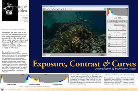
As always, the best thing to do is to get the proper exposure of your underwater images while shooting them. But sometimes this is easier said than done, and there are shots with insufficient exposure, which we, for whatever reasons, simply want to keep and “rescue.”

Contributed by
Factfile
Rico Besserdich is a widely published German photographer, journalist and artist based in Izmir,Turkey.
For more information, visit: Maviphoto.com.
See his latest book at: Songofsilence.com.
So, what is exposure? In photography, exposure is the amount of light that reaches your camera’s digital sensor, as determined by shutter speed, lens aperture and scene luminance. “Correct” exposure is an exposure that achieves the effect the photographer intended. However, cameras or editing tools such as Photoshop or Lightroom are not very interested in our intentions. They only judge the exposure by its technical aspects: counting the pixels, measuring all tones and showing the results in a histogram.
This means that what a histogram might declare as “wrong” may not necessarily be so. Histograms have no knowledge of, for example, the high popularity of underwater images with a main subject in front of a black background. What a histogram tells us about an image can easily turn into a science, but for this tutorial, I will keep it simple.
Let’s look at the three types of exposures in Image 1:
Underexposed: All displayed data in the histogram is pretty much left-orientated, even touching the left border. The white triangle symbol in the upper left indicates the blacked-out shadows (“clipped blacks”). Keep in mind: “too much left = too dark.”
Correct exposure: We have a nice little “hill” of tonal information, which neither touches the left nor the right border of the frame. Both triangle symbols are black, which means: no clipping. Like I said, histograms show the “technical truth” and have only little tolerance for photographer’s intentions.
Overexposed: All displayed data is right-orientated in the histogram and even touches the right border of it. The white triangle symbol in the upper right indicates burnt-out whites (“clipped whites”). Keep in mind: “too much right = too bright.”
A few tips:
- • Shoot RAW. Only RAW images store all information captured by your camera’s sensor, thus providing sufficient image data for postproduction.
- • An underexposed image might get “rescued” during digital postproduction, but there is only little to no hope at all to recover a totally overexposed image. White will stay white. You cannot restore image data where no image data exists.
- • Review the histogram carefully. Sometimes it might appear as totally burnt out (whites or blacks) but if you see that the little “hill” is close to the right or to the left border of the histogram, but “falls down” just a tiny bit before it, then there is still image information to recover... nothing is “lost.”
Now, let’s look at Image 2. Obviously, the photographer did not do a good job here. The image is underexposed. The histogram of ACR (Adobe Camera Raw) proves it as well, showing us a clipped area at the left. But since I cannot dive in such nice places every day, I wanted to fix this image by altering the exposure.
The histogram indicates it is “too dark,” but let’s have a closer look. See Image 3. Everything is pretty much at the left, but that little hill is “falling” down again, just a tiny bit before the left border of the histogram’s frame. This tells me that these are not totally clipped blacks and that there is hope!
Both Lightroom and Photoshop ACR have an exposure slider right below the white balance section. I now carefully move the exposure slider (gently) to the right while simultaneously watching the result—one eye on the image itself, the other one on the histogram, checking for clippings and more importantly, checking how the overall image changes.
Now, the image looks like Image 4. The only thing I did was move the Exposure slider until the exposure was nice (until +1.40 in this example). Luckily, ACR’s histogram agrees with me, showing me a proper tonal range, without clipped blacks and clipped whites.
I usually do not recommend going over +1.50 to prevent nasty noise in dark areas. This, however, also depends on the dynamic range of your camera’s sensor. The better the dynamic range of the camera, the more values can get restored without the risk of too much noise in darker areas of the image. The best way to check is by zooming in to 100% and taking a closer look. See Image 5 and Image 6 to compare the photo before and after adjustment.
Now, let’s see how to do some more fine-tuning with the overall image exposure. For this, I have dug deeply into my archives and found a close-up shot of an octopus from my very first dive with a D-SLR. Straight from the camera and with no alterations done, the image looks like Image 7.
First of all, think about whether this shot is worthy of editing or not. For this octopus shot (and not to be sentimental here), I believe it has potential. The good news is, it takes only five minutes to get this image right.
So, after adjusting the white balance and applying a basic exposure correction, the image now looks like Image 8.
“Quite cool,” one might say. But as we are photographers, it can be both a blessing and a curse to look at images in different and analytical ways. I like the image too, but I believe a few more fine exposure adjustments could be done, striving for a better result.
So, by looking again and very closely at the image, I spot a few things that I want to fix. Let’s have a look at Image 9 together.
- 1. It is somewhat “greyish” and looks sort of “dirty.” This area could use a slight exposure boost.
- 2. It is not “clipped” but pretty close to it. I would like to see some more details in the shadows.
- 3. I think that a fine adjustment of exposure for the eye could “punch” it a bit more.
Once again, it is important to train your photographer’s eye, looking at the finest details and, if necessary, making fine adjustments. Less is often better, and the better your “source material” (i.e. the photograph), the better your final image after postproduction will be.
In Adobe ACR and in Lightroom alike, there are a couple of sliders on the right that allow us to make fine adjustments.
See Image 10. The Highlights slider brings back or darkens the highlight detail. It is very useful for you to recover lost details in slightly “overexposed” areas, and it can also add a little pleasing glow to the overall image.
As for my example image, I found that a little glow would be just the right thing, and so I moved the Highlights slider to +19. This gave the image a slight punch and half-solved the critical (greyish) area “1.”
With the Shadows slider, you can brighten up a lot of information in the shadows. Very dark shadows are not ideal. I was not so pleased with the few very dark shadows in the image (areas 2 and 3 in Image 9), so I brightened the shadows up a bit by moving the Shadows slider to +18.
The Whites and Blacks sliders fine-tune the furthest extremes of your photograph’s range by providing the opportunity to alter black-and-white points of an image. My intention was to give that octopus a bit more glow. I moved the White Slider to +24. Now problem zone 1 looks okay. I then moved the Black slider to +7, slightly lightening up the darker areas. As the last step, I moved the Exposure slider a bit more to the right (to +1.55), just following my own notion of how I want that photograph to look like.
Please bear in mind that you will need to watch the change of finest details in your image AND the changes in the histogram very closely and carefully while working with those sliders. After the white balance, basic exposure adjustment, and fine exposure corrections, see the result in Image 11.
The next step
Flat-looking images share one common problem: insufficient contrast. Of course, the best way to prevent contrast problems is “in the camera”—basically, by doing it the right way when shooting the pictures. But there are images that are not that bad and can be improved using slight contrast adjustments. Again, RAW or DNG are the ideal file formats with which to work.
Before grabbing the Contrast slider or manipulating curves in Photoshop’s ACR (Adobe Camera Raw) or Lightroom, a general understanding of what contrast is helps us make fine postproduction adjustments that give an already good image the final kick.
In photography, contrast is the difference between dark and light; the larger the difference between dark and light areas, the greater the contrast. In very simple words, boosting the contrast in digital postproduction turns bright areas of an image brighter and dark areas darker. The same counts for colours and tones. Everything is about light.
Increasing contrast in digital postproduction should be done carefully and subtly, using very gentle steps. Over-usage can destroy the image.
Now, let’s look at a snapshot (Image 12) I took in the Red Sea while snorkelling. A quick white balance adjustment and a very slight exposure correction altered the Image 12 into Image 13. However, even though the image now appears more colourful, it still looks sort of “flat.” Obviously, a contrast problem. Let’s see how we can fix that.
The easiest way is by using the Contrast slider in ACR or Lightroom, which is placed directly below the Exposure slider. Moving the slider to the left reduces contrast, while moving it to the right increases it. And yes, extreme alterations cause extreme results.
Let’s have a look at two extremes in Images 14 and 15. You might think that moving the contrast slider to the max (+100) improved the image a lot, but while we might have increased the contrast and made the image look “better,” we actually generated a lot of new problems.
As a general rule: Do not overuse it. Always take subtle steps and fine adjustments and always keep your eyes open for the finest details in bright areas, dark areas, and in colours too.
After realising that the notion of “a lot helps a lot” might not be the ideal way to go here, let’s take a critical look at what went wrong in the tutorial image after boosting contrast.
- • We lost almost all the detail in the shadows.
- • We lost detail in the bright tones.
- • Colours are clipped.
In fact, as the Contrast slider increases the overall contrast of the image, the result might look “better” at first glance, but when looking at details—and we should—our eyes catch lots and lots of mistakes. For demonstration purposes, I have used extreme examples, of course. However, whatever you do, always slide the contrast very slightly... or do not move it at all, as we can use the Curves tool for a much finer contrast adjustment.
Curves
Curves are versatile, powerful and scientific. Therefore, I only refer to what curve alterations can do to improve contrast. Modifying curves is the most powerful tool for adding contrast and making an image pop, far better than the Contrast slider can. Furthermore, curve alterations are the top tool for adjusting tones to brighten, darken, shift colours and turn your image into a “better-not-eat-these-sort-of-mushrooms” piece of contemporary art.
Curve controls are found in ACR by clicking on the “tone curve” rider at the top right (second icon). In Lightroom, they are found below the “basics” chapter to the right. See Image 16.
As there are plenty of options here, you may choose one of the pre-sets (linear, middle or strong contrast) and make fine adjustments from there. There are plenty more options, but for starters, I will keep it simple.
The classic way to improve contrast is the “S” curve, where—after your alterations—the diagonal line in the curve controls window ends in an “S” shape. A more pronounced S-shape gives a greater effect to the image’s contrast and makes the image pop.
By applying the “strong contrast” pre-set and slightly moving the points in the curve for fine adjustments, the photo now looks like Image 17. This image is still just a snapshot (and not really a “keeper”), but now it is at least a snapshot with better contrast, and no clipped blacks or whites.
In the end, always check the results of postproduction closely and carefully—the devil is in the details! Curves might look a bit difficult to understand and use in the beginning, but they provide much finer and more accurate options to improve contrast in an image than the Contrast slider. The good ol’ “S” curve is a great place to start! ■