— A small sniff into color psychology and its effects in underwater photography.

Contributed by
Factfile
Rico Besserdich is a widely published German photographer, journalist and artist based in Turkey.
See: www.maviphoto.com.
We people love to have pictures “nice and colorful”, and in fact, it is often the most colorful underwater images that awaken interest and delight in beholders. We are slowly understanding the mystery about why images of anemonefish, or even just simple red starfish, are still so popular.
In general, we distinguish between achromatic (colors without hue such as white, black and all the shades of gray) and chromatic colors (all other colors such as blue, yellow, red, etc).
We human beings are able to see approximately 200 different shades. By changing the intensity of each color shade, we come to approximately 500 different levels of brightness. By altering the amount of white, we get about 20 more color tones per color. The sum of all these shades and tones leads us to the fact that the human eye is able to percieve 20 million colors. This should be colorful enough.
Color is an individual visual perception, caused by light in the area visible to the human eye. For us, this visible range is between 380 nm and 780 nm of the electromagnetic spectrum. There are in fact no colors in existence, there are only different waveforms of the light that are interpreted as colors by our brains.
Not only in the field of photography but also in the entire observable world, we see with our eyes, a “painting with light”. The word “photography” is derived from the Greek word φωτός (or photos), meaning “light” and also “brightness”; and the word γράφειν, meaning “painting” or “drawing”; hence, photography is “light painting”, which remains the key factor.
Our “bandwidth” of color perception is already not too bad, but not comparable to the goldfish (Carassius aureatus which, due to its tetrachromatic spectrum, is able to recognize UV colors as well (as do most birds). But the goldfish does not judge our underwater images.
Very interesting and important to know, in the context of underwater photography, are the psychological effects some colors have. To know this side of color provides us with a powerful tool for using colors “with a plan”, creating images by intention, using the influence of colors to move the human soul.
But caution is advised! Many colors have completely different symbolic power and ways of interpretation in different cultures. And even in the same culture, the interpretation of some colors has transformed over the centuries.
But this much is clear: Colors have a strong associative character and are important elements of design in the visual arts, such as photography.
Red
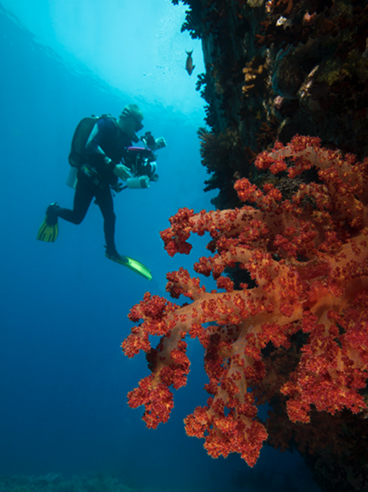
Red (together with blue) is the undisputed color of underwater photography par excellence. Whether it’s a red coral, red starfish, red fish or other marine animal in red, there is a clear visual appeal, and the attention of the viewer is guaranteed.
Red was probably the first color that early humankind was able to perceive at all. Indeed, after injuries in which temporary loss of eyesight is a symptom, the color red is the first color patients are able so see again during recovery—all other colors follow later.
For prehistoric hunting people, red was the most important color, interpreted as a life-sustaining force. Today, red is commonly known as the color of love. Red roses are a symbol of love and fidelity. Red wedding dresses or veils in ancient Rome, China, Albania, Armenia and Greece still bear witness to the symbolism of the color red in heart-related matters.
At the same time, the color red is associated with negative meanings as well.
“O Isis, redeem me, rescue me from the hand of all bad, evil, red things!” was an ancient Egyptian spell 4,000 years ago. Today, red is known as the color of violence (blood, war, or even “seeing red” in the sense of aggressiveness and loss of self-control), as well as a warning (red traffic lights, red alert buttons, brake lights and signs).
Red is the most common color of flags, as flags with red can be seen at long distances.
“Red hair, bad hair!” or “red beard—devil’s beard!” is still present in old folksy proverbs, yet, on the other hand, the Virgin Mary is displayed with red hair in various medieval paintings, and the angels shown in those paintings are wearing red robes.
This is just one example of how the interpretation of color can change, even in one and the same culture. It’s a quite controversial thing.
Commercials, whether in print or on TV, play with red as an erotic and stimulating symbol: red lips, red dresses, red cars should stimulate us and guide our attention to the advertised product. Get your credit cards ready—red sells!
Love, violence, fidelity, aggressiveness, power, sex or the “devil’s style”—whether in the positive or in the negative, the color red always comes with strong impressions and forces the immediate attention of the viewer. Therefore, even an underwater image of an actually not-so-fancy red starfish will be immediately perceived as a “positive” image subject, even if the photo is lacking in technical aspects (out of focus or not perfectly exposed, etc).
Red corals and red fish, or even underwater models wearing red dresses, do guarantee immediate positive photographic effect on your audience, but often this comes from the special psychological effect of the color red itself, and not so often from the beauty of the photographed persons, animals, subjects, or the quality of your photographs.
Blue
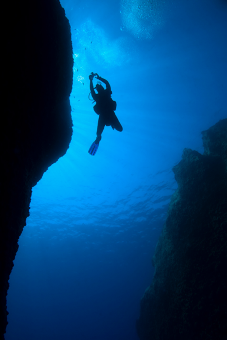
When it comes to the color blue, we divers are very subjective, even biased, because blue is absolutely the “color of divers”—our color! It symbolizes the sea, the vastness of the ocean, and the feeling of freedom, which we feel during our dives in the sea—as well as a touch of nostalgia, too, when we wait impatiently for the next diving vacation, sitting in drafty offices, far away from joy and water.
But, fortunately, we are not alone in this assessment! Blue is (for example) the favorite color of 38 percent of the Germans and 29 percent of Americans. It is associated with sympathy, harmony, kindness, friendship, loyalty, trust, reliability, longing, imagination, but also with coolness, distance and cold.
Blue is also the color of far and wide things, as well as relaxation, silence and peace, and leads to a serious inward view of things. All of this fits perfectly for us divers—the color blue expresses our love for diving.
Johann Wolfgang von Goethe, an important pioneer of color theory, hosted unwelcome guests in blue-painted rooms in the hope that they would not stay unnecessarily long. (Goethe’s office was decorated in green and his dining room was yellow).
The famous “blue letters” from school as well as blue tickets fining drivers for incorrect parking are purposely kept in these colors because of the color psychology behind them: that “blue” messages are more likely to be accepted. But in general, blue is a color with positive characteristics, and this is even true all around the world.
In an underwater image, blue transports the feeling of the wide and provides a logical connection to the element of water to the beholder.
And this is important: What you consider a completely normal interpretation of color might not be automatically clear to others. In the best-case scenario, your images should speak for themselves, without the necessity of long explanations from you, the photographer.
Diving in the sea = the water is blue
—A clear statement that divers, non-divers, and with a bit of luck, even extraterrestrial intelligence can understand. The interstellar space probes Voyager I and Voyager II were outfitted with data about humankind and planet Earth in the hopes of attracting extraterrestrial intelligence, sending them the “who we are, where we live and come by for a drink” message. There was also an underwater image on board. The Voyager probes, drifting in space since 1977, are still collecting data, still looking around for “ET”, but there’s been no answer yet.
Picture No. 55, stored on special hard-drives in Voyager I and II, is an underwater image displaying a wide-angle scene with fishes and a diver in the background, photographed by David Doubilet. The water in this picture is, of course, blue! Therefore, an underwater wide-angle image in the sea should contain the color blue. And each sea has its own shade of blue—there are endless possibilities to play with the color blue, transporting important visual messages of what the underwater world is like.
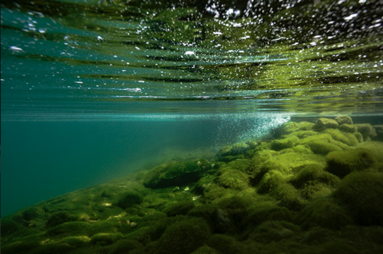
Green
Green is often the color we have to deal with when shooting in lakes. We can therefore say that the color green symbolizes lakes (and rivers) the same as blue represents the oceans and seas. Green is the color of life, plants, spring, harmony and balance. However, it also stands for inexperience (a novice is “still green behind the ears”).
Unlike red, the color green is interpreted as soothing and harmonizing and was for this very reason often used as the dominant color in salon and room decoration. We can therefore see “green” as the color of the silent sounds—an effect and a significance that is very usable in underwater photography because not everything must always be super-bright and shiny. And “the color of silent sounds” sounds nice, too.
Especially plants from local lakes are very beautiful as underwater photo subjects, giving a feeling of freshness and clarity to the viewer.
However, with the color green: Some love it, and some hate it. There is rarely a middle ground. Especially darker shades of green, with a high proportion of brown, are often associated with feelings of disgust rather than freshness. That might not always be an ideal image expression. When working with the color green in underwater photography, choose it in the same way as you would when buying vegetables in the market: get something fresh!
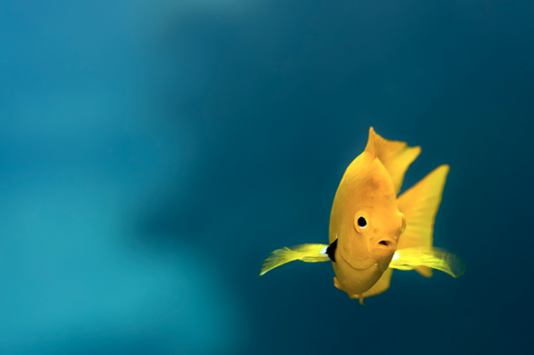
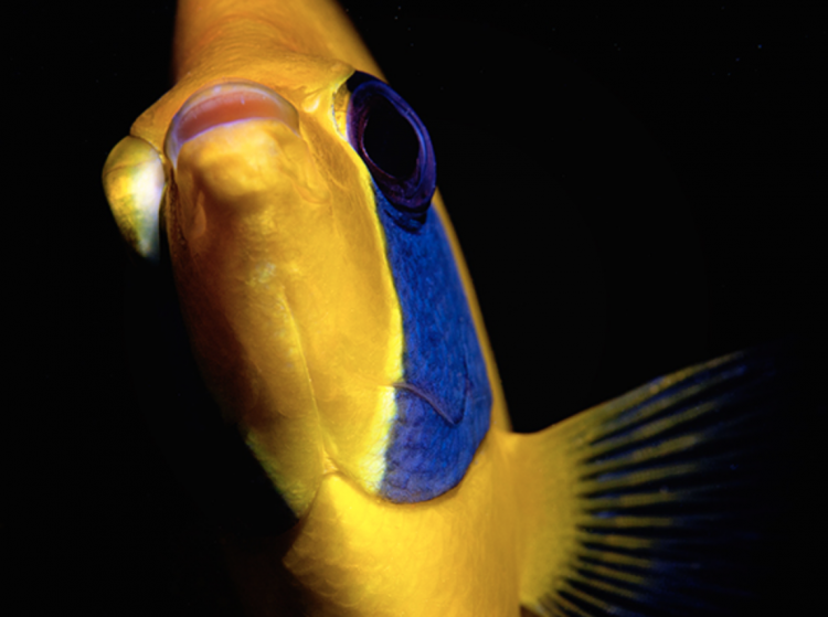
Yellow
The favorite color of Vincent van Gogh is often seen in traffic signals and used as a warning color in marine wildlife. Perhaps some people will turn “yellow with envy” when viewing your underwater pictures. But be careful! The British say people turn “green with envy”.
Symbolically, yellow represents the sun, maturity and the flourishing of life. In China and other Asian countries, yellow represents happiness, glory and wisdom. The color yellow appears as a “positive color”, but has gained a somewhat bad reputation, unfortunately, referring to the cultural development of Europe.
Prostitutes in the Middle Ages were forced to wear yellow capes (and thus, in the opinion of the Christian Church, outed themselves as “unclean”). Where the yellow flag unfurled, the plague raged, and two of the deadly sins in Christianity—envy and parsimony—were symbolized by the color yellow.
Goethe wrote in his 2,000-page book, Theory of Colors, (published in 1810): “The color yellow in its highest purity always carries with it the nature of the light and has a serene, cheerful, gentle, lovely property.”
Wassily Kandinsky (Russian art theorist and painter), however, claimed in 1914: “On the other hand, yellow, when it is viewed directly, concerns people, stands out, harasses them and displays the character of violence, expressed in the color, in the end, rude and pushy in the mind.”
And from circles of psychology, E. P. Mosse wrote in 1997: “This Yellow is the natural and actual color of the morbid mind. As soon as we notice its growing presence, we can be sure that we spot a mental disorder.”
So it is still a pretty controversial color, this yellow.
In the animal kingdom, yellow is a warning color (“Don’t come close to me. I am toxic !”) and as such has a very clearly understood message.
In underwater photography, yellow offers us various opportunities to deal with color as the main carrier of image composition (yellow fish, sponges, corals, anemones), but should not be too dominant in the frame. Because despite all its beauty, the dominance of the color yellow in underwater images triggers feelings of “risk”, “danger” and “discomfort”. In individual cases, this may even come with a negative attitude (in spite of the quality of your photos). If yellow is very interspersed with green, an impression of “dirtiness” may occur as a result.
Playing with color
The ability to play with colors and use them intentionally, always goes hand in hand with a kind of psychological influence. To use this influence to your advantage can be a tool in photographic expression.
Kandinsky said: “Color is a power which directly influences the soul.” Consciously working with color is a key factor in imaging (which of course includes underwater photography as well), in regards to expression, image composition and, of course, “influencing souls.” ■